Dashboard: System Overview
The Dashboard System Overview is your analytics hub for monitoring email performance and account health. All reports on this page update based on your selected filters.
Filtering Your Data
Use the controls at the top to customize your view:
- Broadcasts / Campaigns toggles: Filter by email type, enable one or both
- Date range selector: Choose "Last 30 Days" or set a custom date range

📝 The graph is automatically updated when you change these filters.
Email Performance Chart
The stacked bar chart shows daily email activity with color-coded metrics:
- Sent (Blue) - Emails successfully delivered
- Opened (Teal) - Unique opens, shown with percentage
- Clicked (Green) - Recipients who clicked a link
- Unsubscribed (Yellow) - Recipients who opted out
- Complained (Red) - Spam complaints received
Hover over any bar for a detailed daily breakdown.

New Contacts
Displays contact growth across multiple timeframes:
- Last 24 Hours
- Last 7 Days
- Last 30 Days
- Last 60 Days
Each timeframe includes a mini trend graph showing contact acquisition patterns.

Contacts Cleaning
Shows the total number of bad contacts Campaign Refinery has protected your list from, tracked over the lifetime of your account.
The donut chart breaks down removed contacts by type:
- Undeliverable - Invalid or non-existent email addresses
- Spam Trap - Known spam trap addresses
- Complainer - Contacts who previously marked emails as spam
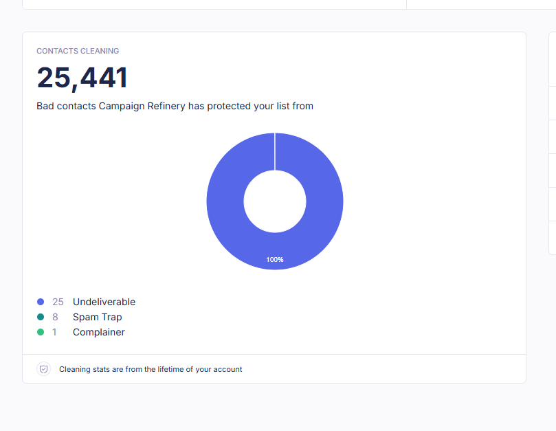
📝 Cleaning stats are cumulative and reflect your account's lifetime data.
Activity Feed
A real-time log of recent subscriber actions including:
- Form completions
- Unsubscribes
- Subscribes
Each entry shows the User, Action, and Time of the activity.
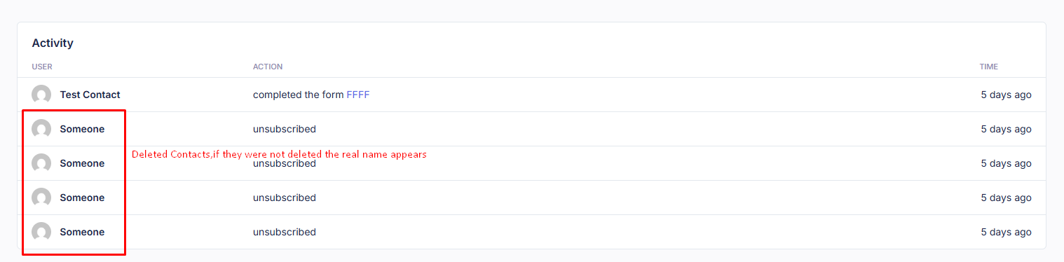
📝 If a contact is deleted, "someone" will appear instead of the user entry.
Last updated on January 15, 2026